This practical requires Matlab. Go through the page and execute the listed commands in the Matlab command window (you can copy-paste). Don't click on the "answers" links until you have thought hard about the question. Raise your hand should you need any help.
Let's start simple. Open matlab, and generate noisy data y using a
linear model with one regressor x and an intercept. I.e. y=a+b*x
  x = (1:20)';
  intercept   = -10;
  slope       = 2.5;
  y = intercept + slope*x;
  y = y + 10*randn(size(y)); % add some noise
Now plot the data against x:
  figure
  plot(x,y,'o');
  xlabel('x');
  ylabel('y');
Let's compare fitting a linear model with and without the intercept. First, set up two design matrices:
    M1 = [x];                % w/o intercept
    M2 = [ones(size(x)) x];  % w/ intercept
Look at M1 and M2 if you are not sure what they should look like (e.g. type M1 in the Matlab command window and press enter).
Now solve the two GLMs:
    beta1 = pinv(M1)*y;
    beta2 = pinv(M2)*y;
Look at the values in beta1 and beta2. How should we interpret the meaning of these values? Answer
Plot the two models against the data:
    figure;hold on;grid on
    plot(x,y,'o');
    plot(x,M1*beta1,'r-');
    plot(x,M2*beta2,'b-');
Note how the red line must go through the
origin (0,0), as there is no intercept in the model
(the intercept is always zero).
Note also how in this case the slope is higher when modelling the intercept. If we were to do statistics on this slope coefficient (to determine if it were significantly different from zero), would we find it more or less significant than if we hadn't modelled the intercept? Answer
Compare fitting the same M2 model (i.e. with a column of one's as a regressor), with and without demeaning x. What happens to the beta coefficients? How do we interpret the values in beta2 after demeaning x? Answer
Ok now let's have some fun with some real data. Download the Oxford weather data textfile from this link: OxfordWeather (right-click on the link and save on the disk).
Now load the text file in matlab and arrange the columns of the text file into different variables:
  data = load('OxfordWeather.txt');

  year       = data(:,1);
  month      = data(:,2);
  maxTemp    = data(:,3);
  minTemp    = data(:,4);
  hoursFrost = data(:,5);
  rain       = data(:,6);
  hoursSun   = data(:,7);

  meanTemp   = .5*(minTemp+maxTemp);
Plot some of the data to familiarise yourself with it.
  figure
  subplot(2,3,1),boxplot(rain,round(year/10)*10);         xlabel('decade');     ylabel('rain');
  subplot(2,3,2),boxplot(rain,month);                     xlabel('month');    ylabel('rain');
  subplot(2,3,3),plot(minTemp,maxTemp,'.k');              xlabel('minTemp');  ylabel('maxTemp');
  subplot(2,3,4),plot(meanTemp,hoursFrost,'.k');          xlabel('meanTemp'); ylabel('hoursFrost');
  subplot(2,3,5),boxplot(rain,round(meanTemp/3)*3);       xlabel('meanTemp'); ylabel('rain');
  subplot(2,3,6),boxplot(hoursSun,month);                 xlabel('month');    ylabel('housrSun');
You may notice from these plots that there is nothing much to model about the rain (at least with a GLM). It simply rains all the time... Instead, let's model the rest of the data in various ways:
Here we will switch gears and turn our attention to eigenvalue decompositions. We will use eigenvalues in the context of data dimensionality reduction.
First, let's generate a 2D data cloud. The following code generates data that follows a Gaussian distribution with a covariance matrix that has a 60 degree rotation with respect to the x-axis. Read the code carefully and try to understand all the different steps.
  mu=[5;2];                                     % mean position
  ang=60;                                       % angle in degrees
  R=[cosd(ang) -sind(ang);sind(ang) cosd(ang)]; % rotation matrix
  sig=R*[1.3 0;0 .1]*R';                        % rotated covariance matrix
  y=mvnrnd(mu,sig,100);                         % create points using multivariate gaussian random

  % In case where mvnrnd is not installed (statistics toolbox), use
  % Cholesky decomposition to generate the samples:
  A=chol(sig);
  y=(repmat(mu,1,100) + A'*randn(2,100))';

  figure,hold on                                % plot the data
  plot(y(:,1),y(:,2),'b.');
Now keep the previous plot open, demean the data, and plot the demeaned data on the same plot.
  ydemean=y-repmat(mean(y),100,1);
  plot(ydemean(:,1),ydemean(:,2),'k.');
Next, calculate the eigenvalue decomposition of the covariance matrix and plot the eigenvectors scaled by the square-root of their eigenvalues.
  [v,d]=eig(cov(y));
  d=sqrt(diag(d));

  % Plot the two eigenvectors
  axis equal,
  quiver(0,0,v(1,2),v(2,2),3*d(2),'color','r'); % major eigenvector
  quiver(0,0,v(1,1),v(2,1),3*d(1),'color','b'); % minor eigenvector
It should be clear that the major eigenvector (in red) is aligned with the direction of most "variance" in the data, and that the minor eigenvector is orthogonal to the major one, and is aligned with the direction of least variance. This is true because we have generated data using a Gaussian distribution.
Now project the data onto the first eigenvector and plot the projected data.
  yy = (ydemean*v(:,2))*v(:,2)';
  plot(yy(:,1),yy(:,2),'g.');
Now we do the same thing, but this time on a data set that does not have an interesting direction of maximum variance, but instead has information that is cast along a "radial" dimension.
Start by generating the doughnut data set (make sure you understand what each line is doing in the following code):
  t = 2*pi*rand(1000,1); % random angle
  r = .5+rand(1000,1);   % random radius between .5 and 1.5
  x=r.*sin(t);
  y=r.*cos(t);

  figure,set(gcf,'color','w'),hold on
  plot(x,y,'o')
  axis equal
Now do the PCA on this data by calculating the eigenvalues of the covariance matrix:
  Y=[x y];
  [v,d]=eig(cov(Y));
  d=sqrt(diag(d));

  quiver(0,0,v(1,2),v(2,2),3*d(2),'color','r');
  quiver(0,0,v(1,1),v(2,1),3*d(1),'color','b');
The resuting directions, as you can see, do not indicate any particularly useful feature of the data. In fact, they are completely random (driven by the noise, since the model is completely symmetric).
Furthermore, if we project the data onto the mean eigenvector, we loose all information on the doughnut:
    ydemean=Y-repmat(mean(Y),size(Y,1),1);
    yy = (ydemean*v(:,2))*v(:,2)';
    plot(yy(:,1),yy(:,2),'g.');
Now one last data-cloud example. Consider the data generated with the following bit of code:
  y1=mvnrnd([0;0],[1,0;0 20],1000);
  y2=mvnrnd([5;0],[1,0;0 20],1000);
  y=[y1;y2];
  y=y-repmat(mean(y),2000,1); % demeand the data to keep things simple

  figure;hold on
  plot(y(:,1),y(:,2),'k.');
  axis equal
As you can see, the data comes in two interesting clusters. However, the direction of maximum variance is orthogonal to the direction that separates the two clusters. Let's see how this affects the results of a data reduction that uses PCA.
First calculate the eigenspectrum of the covariance matrix and plot the major and minor eigenvectors:
  [v,d]=eig(cov(y));
  d=sqrt(diag(d));
  quiver(0,0,v(1,2),v(2,2),3*d(2),'color','r'); % major eigenvector
  quiver(0,0,v(1,1),v(2,1),3*d(1),'color','b'); % minor eigenvector
Now project the data onto the first eigenvector. You can see that the cluster information is completely lost. PCA is not a good way to cleanup this data.
  yy = (y*v(:,2))*v(:,2)';
  plot(yy(:,1),yy(:,2),'g.');
Let us finish with a fun example, PCA of the world map. I've chosen the world map because, although the data is multi-dimensional, which precludes from simple data-cloud style visualisation, information in the data can still be visualised as a matrix.
First, download the data file from here.
Now open the data in Matlab and visualise it
with imagesc.
  im = double(imread('world-map.gif'));  % read image
  im=sum(im,3);                          % sum across the three colour channels
  imagesc(im);                           % display the image
Start by calculating the eigenspectrum of the data covariance matrix:
[v,d]=eig(cov(im));
Now we are going to reduce the dimensionality of the data by reconstructing the data using a subset of the eigenvectors. To this end, we need to first demean the rows of the data matrix:
  x=im;
  m=mean(x,2);
  for i=1:size(x,1)
    x(i,:) = x(i,:) - m(i);
  end
Next, reconstruct the data using only the top p
eigenvectors. Look at what happens with and without adding the mean
back to the data. Play with different values of p. When
do we start seeing Great Britain?
    p=4;
    % reconstruct the data with top p eigenvectors
    y = (x*v(:,end-p+1:end))*v(:,end-p+1:end)';
    % plotting
    figure
    subplot(3,1,1);imagesc(im)
    subplot(3,1,2);imagesc(y)
    % add mean
    for i=1:size(x,1)
      y(i,:) = y(i,:) + m(i);
    end
    subplot(3,1,3);imagesc(y)
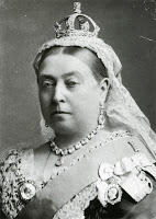
Same as above but with Queen Victoria. When do you start to see her moustache?
  im = double(imread('Queen_Victoria_by_Bassano.jpg'));
  im = sum(im,3);

  % reconstruct the data with top p eigenvectors
  [v,d]=eig(cov(im));
  p=4;
  x=im;
  m=mean(x,2);
  for i=1:size(x,1)
    x(i,:) = x(i,:) - m(i);
  end
  y = (x*v(:,end-p+1:end))*v(:,end-p+1:end)';
  % plotting
  figure
  colormap(gray);
  subplot(1,3,1); imagesc(im);
  subplot(1,3,2); imagesc(y);
  % add mean
  for i=1:size(x,1)
  y(i,:) = y(i,:) + m(i);
  end
  subplot(1,3,3); imagesc(y)
The End.