Biomedical Sciences - Matlab introduction 1
Simple plotting
MATLAB is very useful for graphics. Let's start with a simple example. We will plot the function sin(x) for -π<x<π.
First, define a vector of numbers between -π and π:
x=-pi:0.01:pi;
Notice the literal use of the word 'pi' in the above command. We can do this because 'pi' is an internal MATLAB variable that takes value 3.1415926... (it will not recognise other greek letters!).
This command creates a vector of numbers between -π and π with a step of 0.01 (meaning the space between consecutive entries in the vector is 0.01).
Note how many entries the vector x has:
size(x)
The result should be 1 629, i.e. an array with 1 row and 629 columns. This can also be called a row-vector with 629 entries.
If we want to control the number of entries in x instead of choosing the interval between two consecutive values, we can use this command instead (in this case we want 1000 entries):
x=linspace(-pi,pi,1000);
Check that the number of entries in x is exactly 1000 by typing size(x).
Now we define a vector that calculates the sine of x:
y=sin(x);
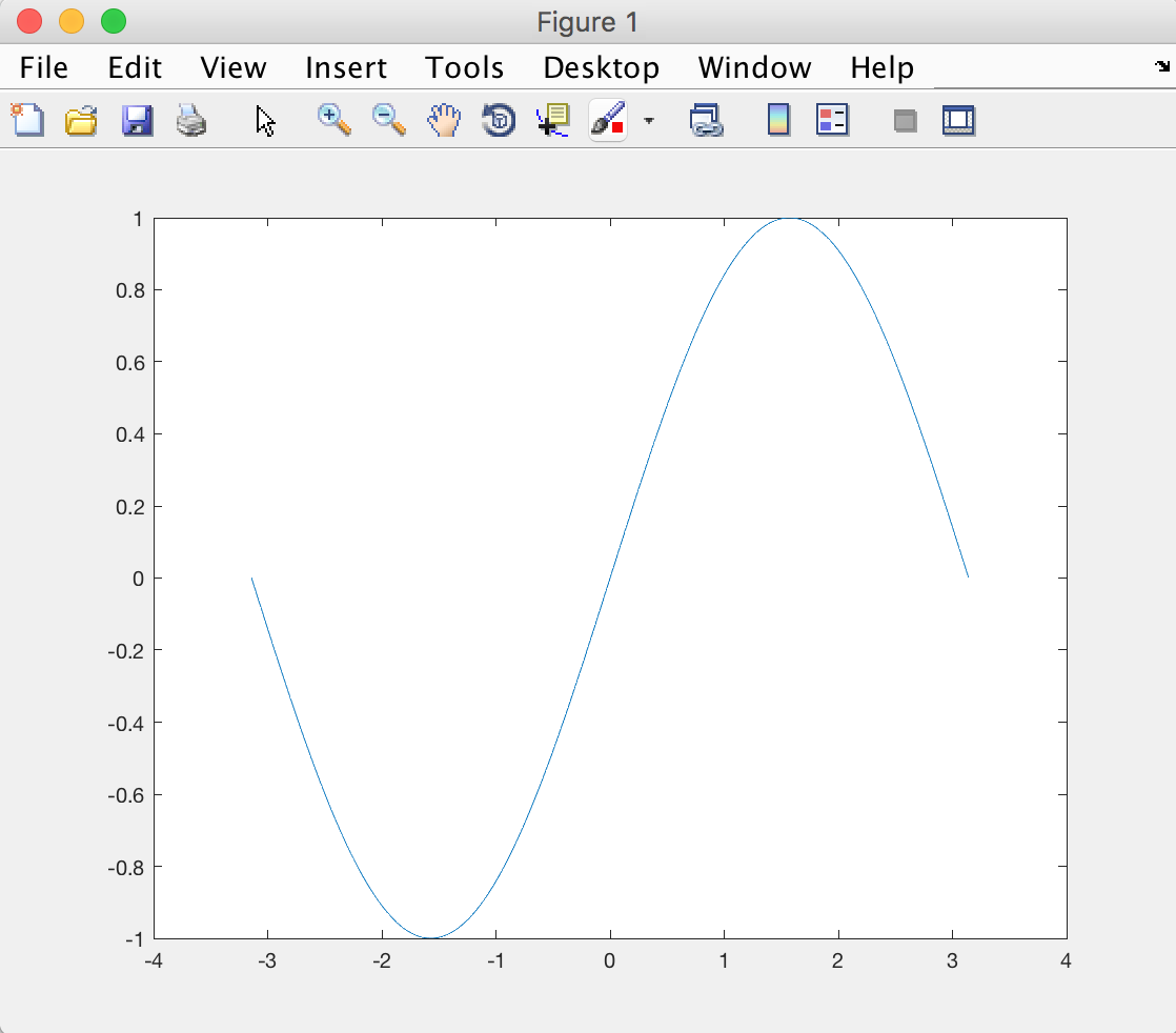
We are now ready to draw the sin(x) function. We will use the plot command to draw the function:
plot(x,y);
You should be able to see something like this:
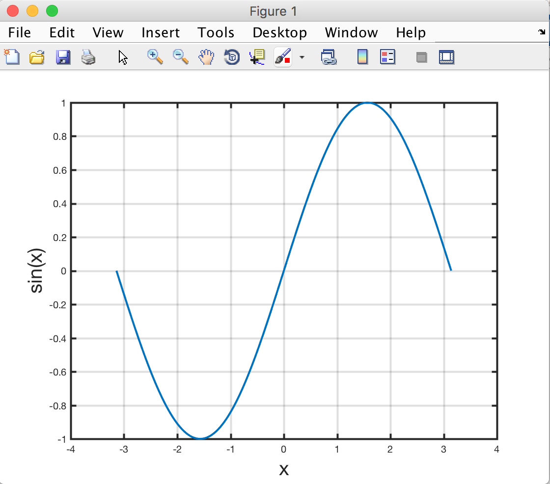
Let's see if we can make this figure look a little bit prettier. First, we add labels for the x and y axes (it is good scientific practice to always have labels on axes). We also (optionally) set the fontsize a bit bigger than the default.
    xlabel('x','fontsize',20)
    ylabel('sin(x)','fontsize',20)
Now let's add a grid:
grid on
Finally, we can make the axes a little thicker and the background white. For that we will use the following commands:
    set(gca,'linewidth',2)
    set(gcf,'color','w')
Why gca and gcf, you might ask? These mean "Get handle to Current Axes" and "Get handle to Current Figure". It is a way for the set function to know which figure/axes to apply the changes to. Handles are useful in case you have several figures and you only want to change some of them.
You should now be able to see something like:
Controlling properties of figures, axes, and plots
In our example above, we used the set command to change the properties of the figure and axes. There is another way to do this in a more intuitive, flexible way which will also allow us to control the properties of our plot.
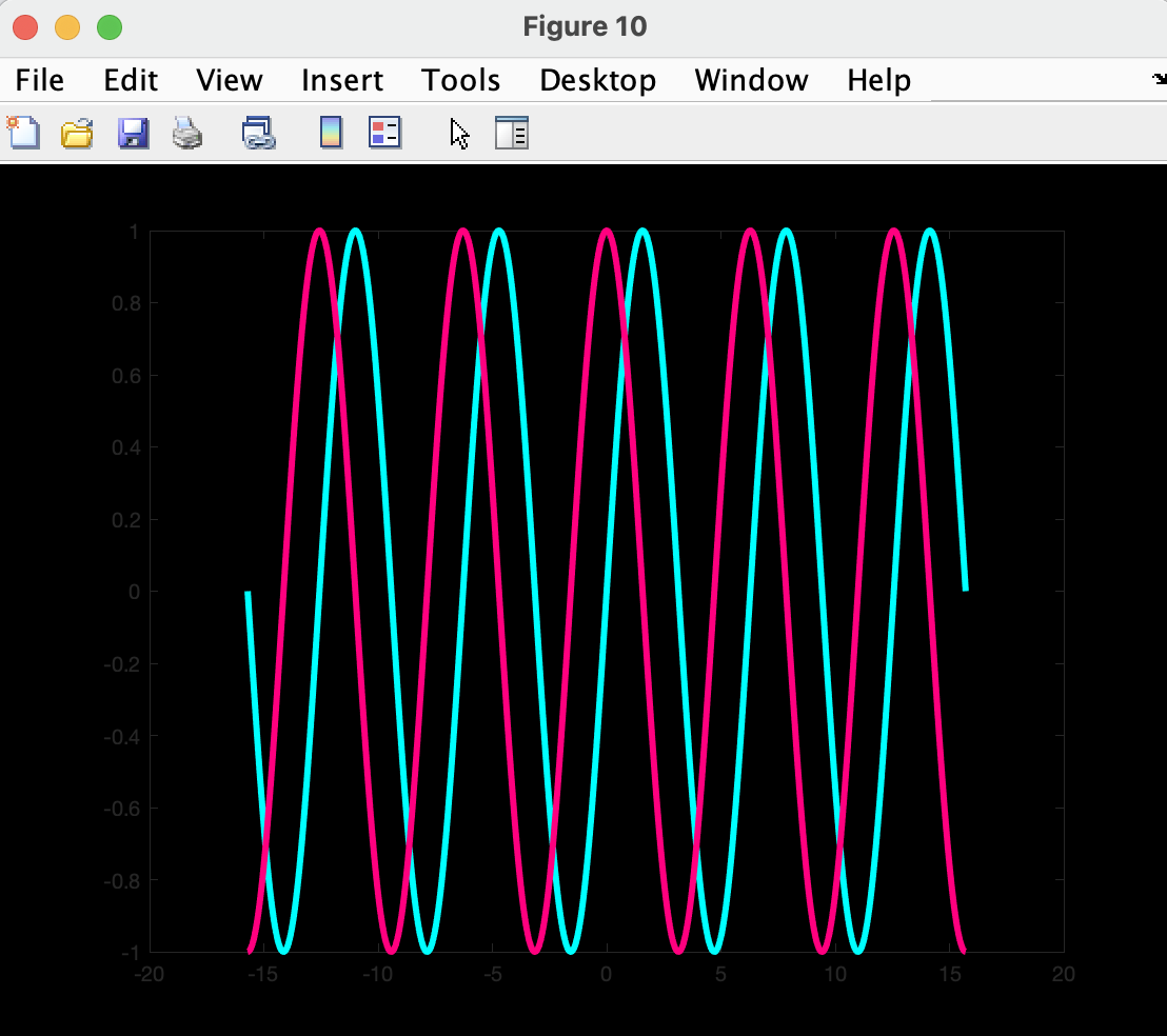
Let us plot two functions, sine and cosine, over a longer interval. Run the code below to create the variable we need to plot:
    x  = linspace(-5*pi,5*pi,1000);
    y1 = sin(x);
    y2 = cos(x);
And now these 4 commands:
    f  = figure;
    a  = axes;
    h1 = plot(x,y1);
    hold on  % this is just to keep the first plot when plotting the second
    h2 = plot(x,y2);
The above creates a figure but also 4 variables f, a, h1, h2. These are called handles in matlab terminology. The first is a figure handle, and allows us to control the appearance of the figure, the second does the same for the axes on the figure, and the last two allow us to control the two plots.
Type the names of these 4 variables on the matlab terminal:
    f
    a
    h1
    h2
You should be able to see some of the properties that you have access to for each of these objects. In the code below we will alter the properties of all 4 objects, read the code and make sure you understand what it does. Feel free to change it (e.g. change the colour choices or change other properties):
    % Changing the figure properties
    f.Color = 'k';   % 'k' for black
    % Axes:
    a.GridLineStyle = '-';
    a.Color         = 'k';
    % Plots
    h1.LineWidth = 3;
    h2.LineWidth = 3;
    h1.Color     = [0 255 255]/255; % RGB
    h2.Color     = '#FF007F';       % Hexadecimal
The properties of all these objects can be accessed and changed using the . operation.
You should also be ale to see that we have used 3 different ways of defining colours. The first is a matlab shorthand for some prespecified colours (e.g. 'w' for white, 'y' for yellow, 'b' for blue...). The second is a RGB (Red/Green/Blue) code. This is generally a triplets of numbers between 0 and 255, but matlab wants them to be between 0 and 1, so we divide by 255. The third is called a hexadecimal code, and encodes the RGB code in a hexadecimal number. If you want to pick different colours and you don't know their codes, you can check out this website : https://www.rapidtables.com/web/color/RGB_Color.html
If run the above code you should be able to see something like this:
3D plotting
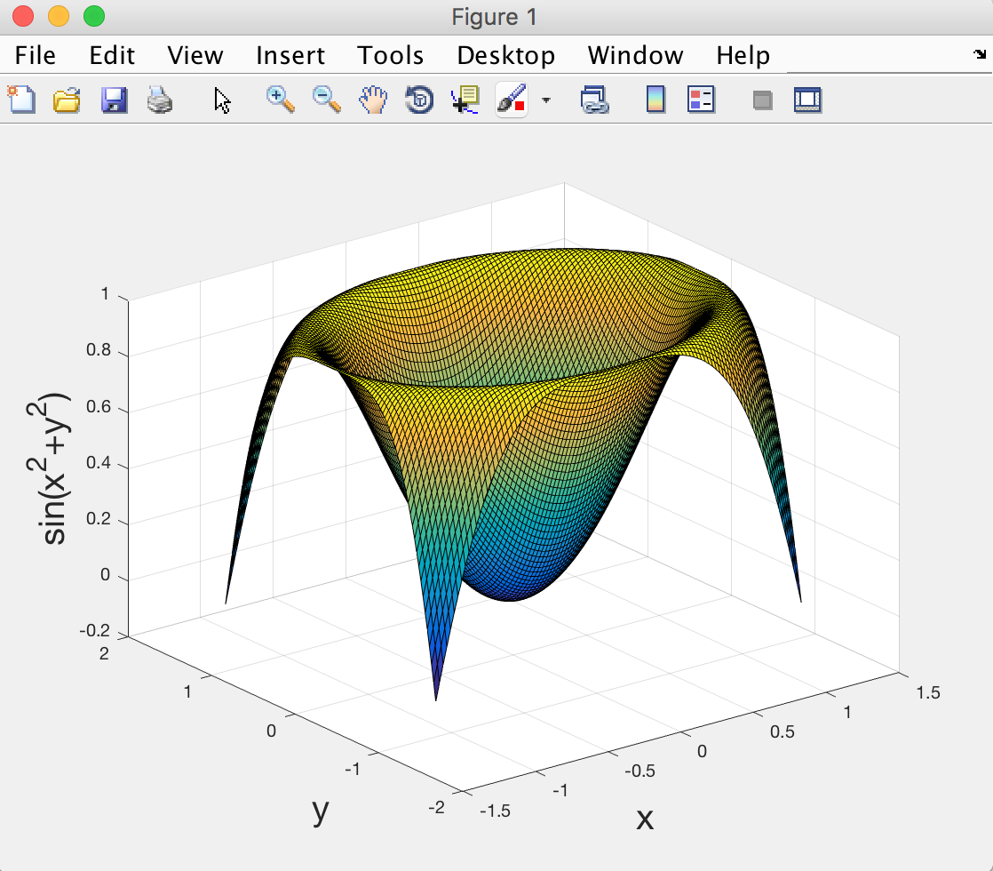
Let's do some more advanced drawing. This time we will draw a function of 2 variables f(x,y)=sin(x2+y2). We start by defining x and y, for example as vectors between -2π/5 and 2π/5:
	 x=linspace(-2*pi/5,2*pi/5,100);
	 y=linspace(-2*pi/5,2*pi/5,100);
Now the tricky bit: we want to draw a function f(x,y) for every pair of values x and y in the interval [-2π/5 2π/5]. For that, we need to turn the vectors x and y into a grid with the command:
[x,y]=meshgrid(x,y);
This turns x and y into matrices. Look at the values in x and y after you've run meshgrid and see that every possible pairing of x and y is encoded.
Now we create a variable that stores the values of the function on this grid:
z=sin(x.^2+y.^2);
Note the ".^2" is used for squaring a variable. We are
now ready for plotting the function. There are several possible commands that will produce different types of plot. The most fun is surf, which represents the function as a surface:
surf(x,y,z);
Now if you add axis labels (as we have done earlier), you should be able to see something like:
Loading and plotting actual data
Now let's play with some real world data! I like to use Oxford weather data, which I originally found here: http://www.metoffice.gov.uk. You can download a textfile of a cleaned up version from this link: OxfordWeather (right-click on the link and save on the disk - make sure to note where the file is saved as you need to run the matlab command below from the same folder to load the file).
Once you downloaded the weather data file, change the matlab folder to where you've saved the file and type:
data=load('OxfordWeather.txt');
This will create a variable called 'data', which is a table of numbers (996 rows and 7 columns). You can check the size of the data table with size(data).
The different columns of numbers represent data collected every year from 1929 to 2011, and the data is listed in the following order:
     1st column =   year
     2nd column =   month  (1 to 12)
     3rd column =   mean daily maximum temperature (in degrees)
     4th column =   mean daily minimum temperature (in degrees)
     5th column =   days of air frost
     6th column =   total rainfall (in mm)
     7th column =   total sunshine duration (hours)
Now let's make a simple plot of maximum temperature as a function of month of the year. Begin by creating one variable for month and one variable for maximum temperature:
     month = data(:,2);
     maxTemp = data(:,3);
In the command above, we use the ':' to mean 'all
rows of the data table', and the number represents which column we
want to extract. If for example we only want rows 1 to 10 and column
2, we would write e.g.: month=data(1:10,2). This type of syntax is called 'indexing' in MATLAB.
Now let's do a quick plot of the max temperature data:
plot(month,maxTemp,'o');
The symbol 'o' means draw one little circle per data point (instead of the default, which is to draw lines). You can look at the help for the plot command to see what other options are available.
Now let's not forget the axes labels like good scientists do!
     xlabel('Month')
     ylabel('Maximum temperature (degrees Celcius)');
Two things to notice in the plot: (1) The temperature rises from the first month to the middle, then drops again; this is because Oxford is in the northern hemisphere (duh); and (2) within each month of the year, there are variations from one year to the other, so the data points coming from different years (between 1929 and 2011) do not overlap exactly. In fact there can be as much as 10 degree fluctuations!
It is more informative to have names of months on the x-axis instead of numbers. Let's do that:
First, define a variable that contains the names of the 12 months. We will use a 'cell array', instead of a vector (by using curly brackets {} instead of square brackets []). This is because the names of months are text and not numbers:
names = {'Jan' 'Feb' 'Mar' 'Apr' 'May' 'Jun' 'Jul' 'Aug' 'Sep' 'Oct' 'Nov' 'Dec'};
And to include these into the figure, we use the following syntax:
set(gca,'xtick',1:12,'xticklabel',names);
You should now be able to see something like this:

Note we could also have used the other syntax where we modify the object properties one by one:
     f = figure;
     a = axes;
     h = plot(month,maxTemp,'o');
     a.XTick       = 1:12;
     a.XTickLabels = names;
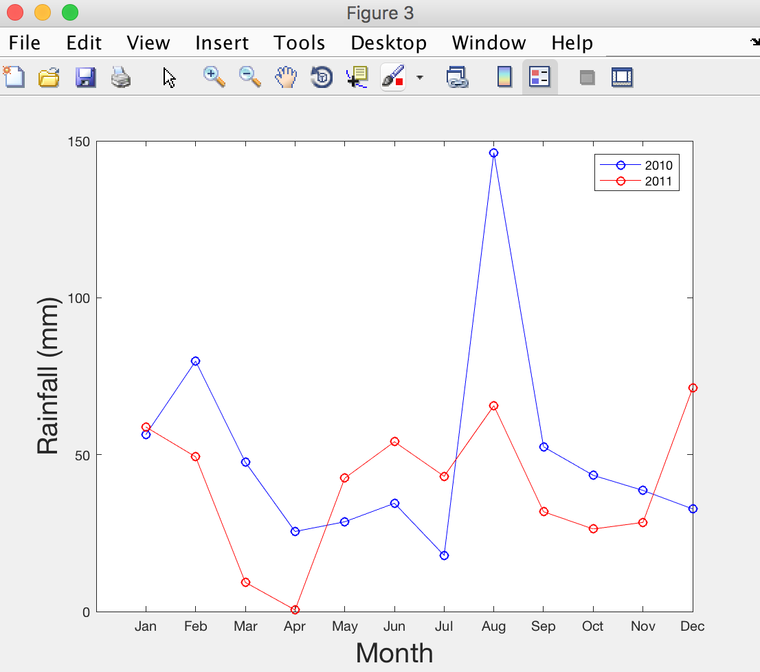
Ok let's plot something slightly more complicated (but more fun). For this we need another two variables: year and rain:
     rain = data(:,6);
     year = data(:,1);
We want to plot the yearly rainfall in the years 2010 and 2011 (in different colours so we can compare them). Let's begin. The following code has two new pieces of syntax. Run the code and then read the explanation that follows.
     figure
     x = month(year==2010);
     y = rain(year==2010);
     plot(x,y,'bo-');

     hold on

     x = month(year==2011);
     y = rain(year==2011);
     plot(x,y,'ro-');
Notice the use of 'year==2010' and 'year==2011'. This is another (very useful) way of doing 'indexing' in MATLAB, using the logical operator '=='. This will select the entries in 'rain' and 'month' that correspond to when the 'year' variable is equal to 2010 or 2011.
The second piece of syntax is the use of 'hold on'. Without it, the second plot would have erased the first one, so we use this syntax to superimpose different plots. You only need to use hold on once and then add as many plots as you want. If you want to revert back to erasing current plot, you can use hold off.
Now let's add axis labels and replace the x-axis numbers with month names as before:
    set(gca,'xtick',1:12,'xticklabel',names);
    xlabel('Month','fontsize',20)
    ylabel('Rainfall (mm)','fontsize',20);
Finally, let's add a legend:
legend({'2010' '2011'})
Looks like August was particularly miserable in 2010... But April 2011 was great!
Excercise
In order to reinforce the few lessons learnt in this practical, we will finish with an exercise.
Using the Oxford weather data, can you extract the maximum daily temperature of the years 1930, 1960, 1990, and 2010; plot them as a function of the month of year, make the plot pretty, and save it as a JPEG image. Click here for example answer
The End.
Created by Saad Jbabdi (saad@fmrib.ox.ac.uk)